
At a glance
- The challenge
- Advisers had the research, the tools and the client data, spread across a workstation with dozens of pages. Nothing told them what had changed for their clients that morning.
- What I did
- Designed the beta that shipped, then reviewed it in the wild, named six problems, and designed one assistant across the whole suite on the Morningstar Design System, down to thirty edge cases.
- Where it landed
- A beta that 34% of eligible advisers adopted. Then one assistant with three ways in, answers with sources, and nothing client-facing without a review, a receipt and an undo.
- 34%adoption among eligible advisers during the beta
- 45%fewer workflow steps from question to report
- 3journeys shipped end to end in the beta
- 56use cases mapped across the suite, 42 designed
- 30edge cases designed before the happy path
- 0client-facing actions without a review and a receipt
01 · Setting the scene
An adviser's morning, before the assistant
Direct Advisory Suite is Morningstar's workstation for financial advisers in the United States: clients, portfolios, the Screener, X-Ray, reports, research and news. Its home page was a news front page. Everything an adviser needed was in the product. Very little of it came to them.
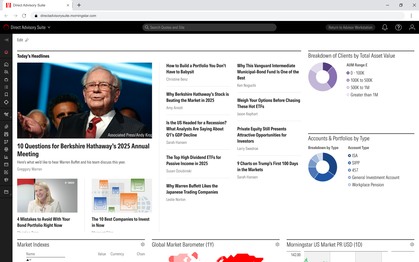
The question every adviser asks each morning is "what changed for my clients, and what should I do about it?" The workstation could answer it, if the adviser already knew which fund was downgraded, which client had drifted, and which of twenty pages to open.
How might we
Give advisers an assistant that tells them what needs attention, answers in a shape they can check, and can act for them without ever acting without them.
I framed the work around three moments in the day, because each needs a different kind of help.
Morning
What changed?
A fund was downgraded. A client's risk drifted. The adviser has not asked yet, and should not have to.
Research
Find and compare
"Show me the top rated ETFs." The answer is a table to sort and take further, not a paragraph.
Client work
Do the task
A statement arrives as a PDF. Build the portfolio, check the risk, run a scenario, produce the report.
02 · My part in it
What I owned
I was the designer on the assistant from its first screens to the unified design: how it behaves before a question is asked, what an answer looks like, how one answer leads to the next, where it lives in the suite, and how it looks and speaks. I worked with the product and AI teams on what the model could reliably do, with compliance on what it was allowed to do, and with the design system team so that every screen reused library components.
03 · Act one: the beta
What shipped first
Four rules before any screen: bring the change to the adviser, answer with the product and not with prose, say what it means for my book, and show the working.
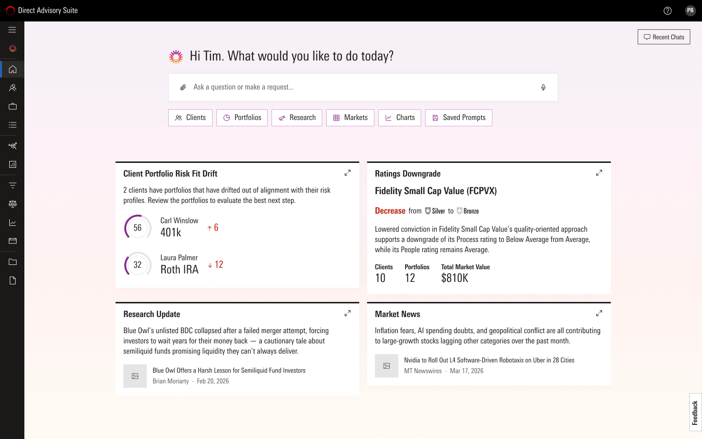
The home opened on a greeting, a prompt, and two modules that had already done the morning's work: Ratings Changes and Client Risk Fit Drift, ranked High or Medium by published scoring rules, with the exposure on every row. The assistant did not ask to be trusted; it showed the arithmetic.
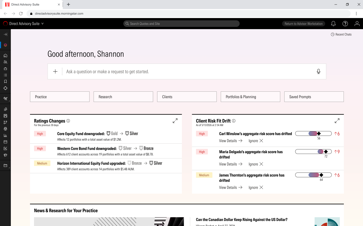
Three journeys, one for each moment. "Show me the top rated ETFs" returned the Screener itself, with the steps it took and three follow-ups. A statement PDF became a portfolio, its X-Ray, a snapshot report and a crisis scenario, with the likely next step pre-filled in the prompt. A drift card opened a breakdown of which portfolio was driving it, then a rebalance recommendation.
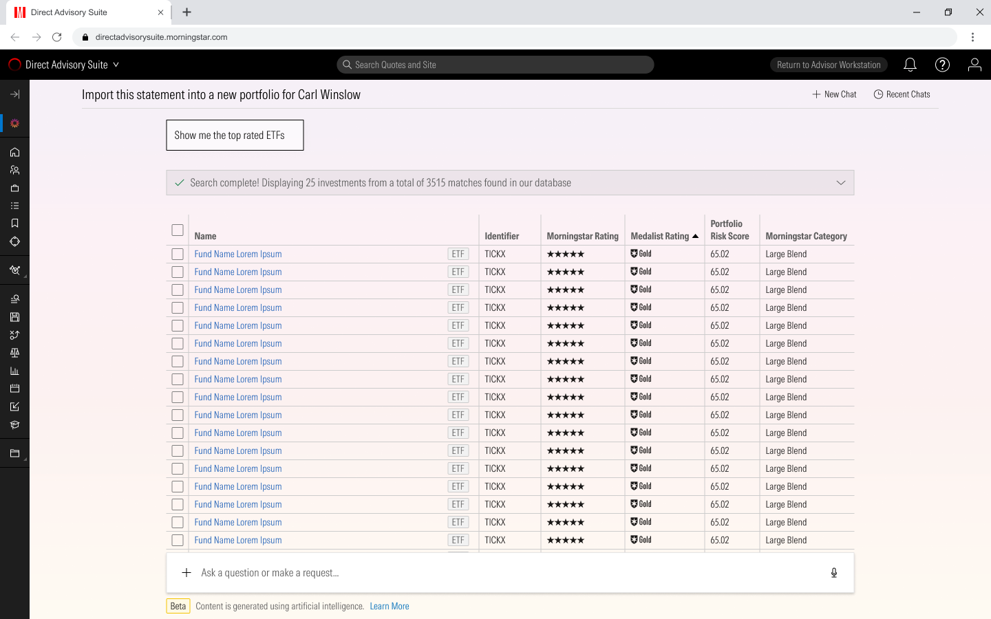
ResearchThe Screener, not a paragraph
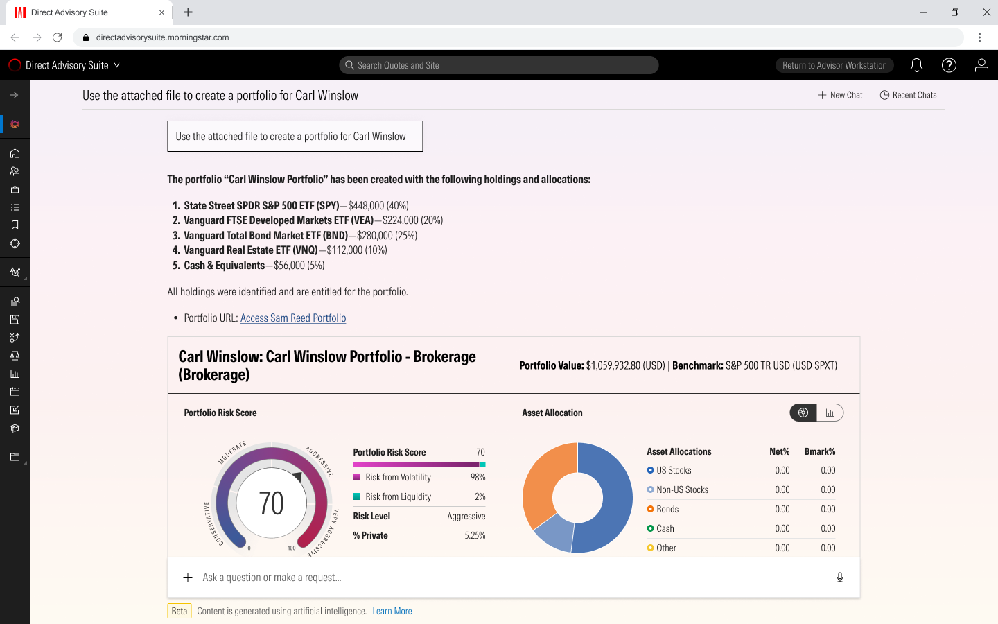
Client workFrom a PDF to a portfolio and its X-Ray
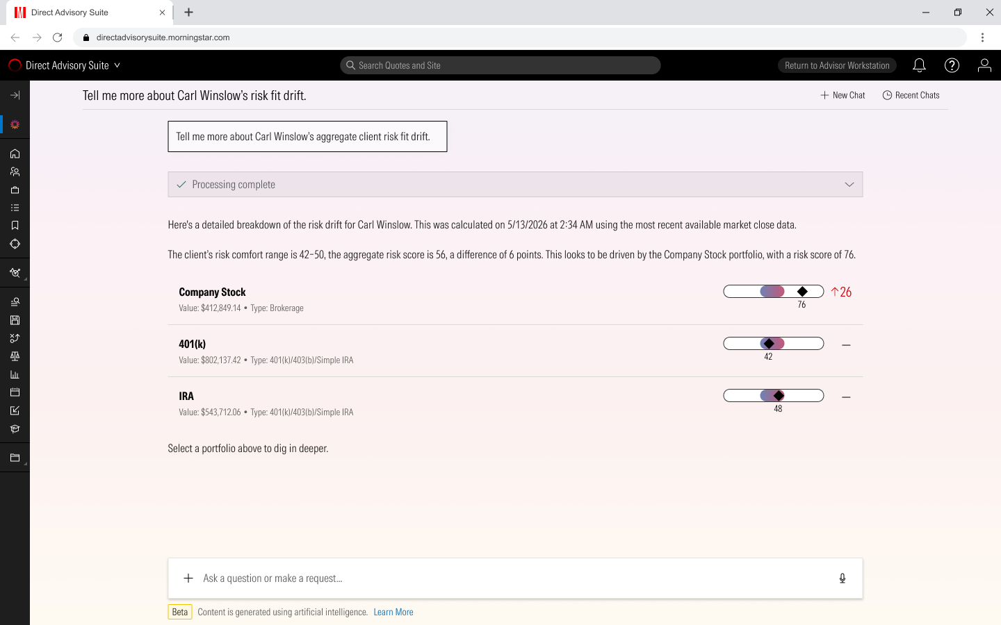
AlertsWhich portfolio is driving the drift
We chose to embed it in the suite rather than give it its own tab, by designing both to the same depth and comparing them on real screens. It shipped as a beta. 34% of eligible advisers used it, and the journeys cut the steps from a question to a report by 45%. That is where most case studies stop. This one turns here.
04 · The turn
Six things the live beta told me
Once it was live I went back through everything: seven Figma files, the beta itself, and my own review of its answers.
01
Context is the product
Advisers ask about the client or list on screen. Retyping a name into a separate chat was the top friction.
02
Answers changed shape
The same question, asked six ways, gave six different answers.
03
Claims without proof
Twice it said a comparison was ready and showed nothing.
04
The answer is not the end
The real job is the email, the proposal or the report that follows.
05
Compliance is a user too
Supervisors need what was said and done, for whom, from which sources, and who approved it.
06
Seven files, seven systems
Different headers, three purples, two typefaces, hand-drawn icons. None of it was the design system.
The review was the moment. I asked for the same thing six times, compare two portfolios, and got six different answers: prose, a tool with no summary, a promise with nothing behind it. So I wrote the answer I wanted as a template, and from then on treated the model's output as a design surface with a spec and a review.

Attempt 1Promised a comparison, showed none
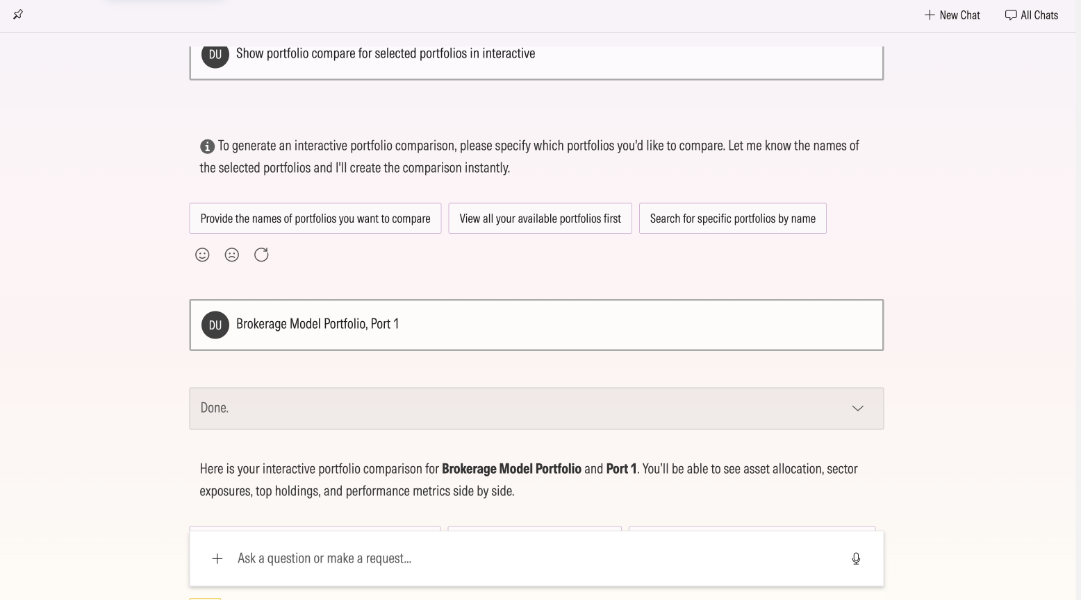
Attempt 2Asked for names it already had

Attempt 3The tool, with no summary
05 · The bet
One page, before any screen
The bet
An assistant that knows the adviser's book, cites every figure and drafts the next step for them to approve will give advisers their day back, without taking the decision away from them.
One assistant across the suite, three ways in: the Assistant page, a panel on the client, list or account already on screen, and one search box from anywhere. Every answer follows the same loop: plan, sourced answer, proposed action, adviser review, receipt with undo.
Designed for the lead adviser with 120 households, and shaped by the associate who does the bulk work, the compliance supervisor who approves it, and the firm administrator who sets the limits. Six hypotheses, each with a way to be wrong, and a map of 56 use cases, 42 of them designed, decided what went into the pilot.
06 · How I went about it
Six principles, two directions, one merge
01
Meet the adviser where they are
The assistant comes to what is on screen. The scope is always visible and always the adviser's choice.
02
No figure without a source
Every number carries its source and its as-of date.
03
Show the work
Long answers show the plan as they run. Partial answers say so.
04
End with a next step
Every answer offers one action, drafted and ready to review.
05
The adviser decides
Nothing reaches a client without approval, and every action has a receipt.
06
Quiet by default
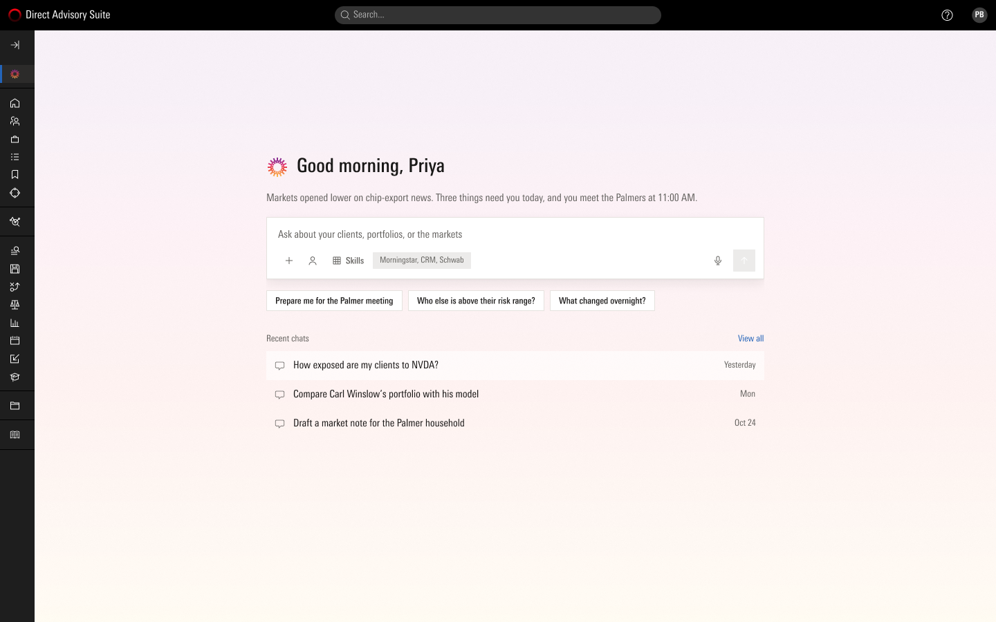
The returning view is the chatbox and recent chats. AI styling marks only AI surfaces.
Then two whole directions to the same depth, 37 screens and 39, because the beta had taught me that a decision made on real screens does not get reopened. Option A kept the adviser's muscle memory and was easy to ignore. Option B turned answers into outcomes and felt like a different product. The final design keeps A's shell and B's behaviour.
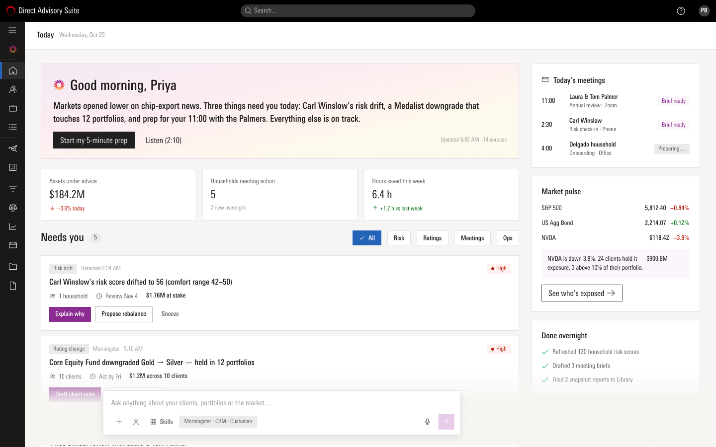
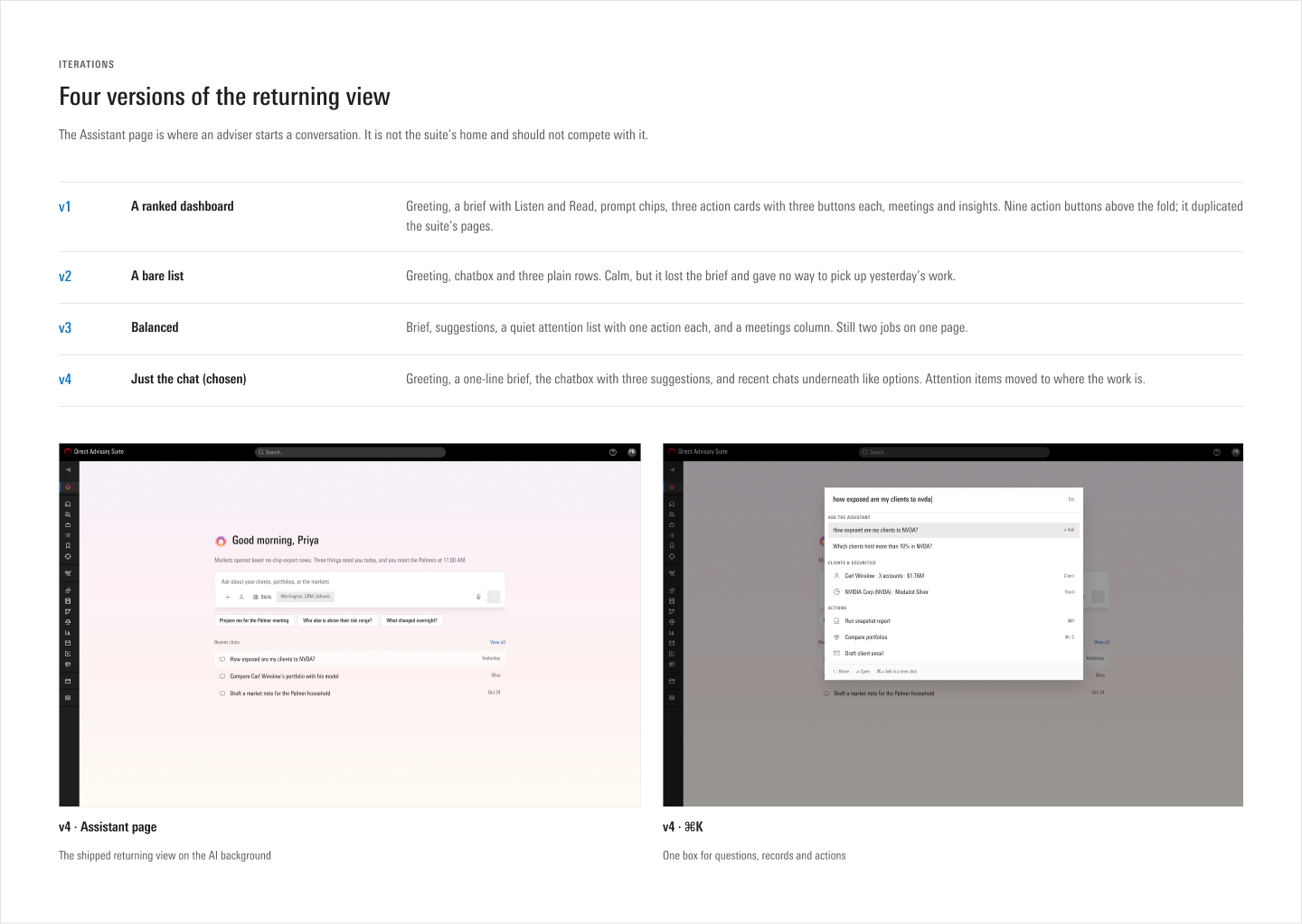
The merge got one thing wrong. The Assistant page started as a ranked dashboard with nine action buttons above the fold, and it duplicated the suite's own pages. Four versions later it is just the chat, and the attention items moved to where the work is.
07 · The walk: one adviser's morning
Notice, ask, answer, approve, receipt
This is where I spend most of the time in a walkthrough: one adviser, one morning, end to end.
She starts on the Assistant page
A greeting, a one-line brief ("Three things need you today, and you meet the Palmers at 11:00 AM"), the chatbox with three suggestions drawn from her book, and recent chats underneath. Nothing competes with the suite's own pages.
The assistant is already where she is working
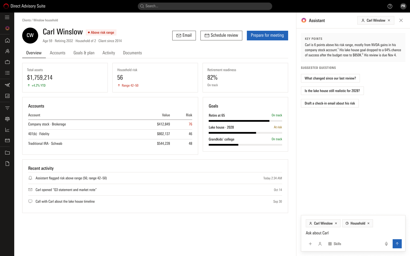
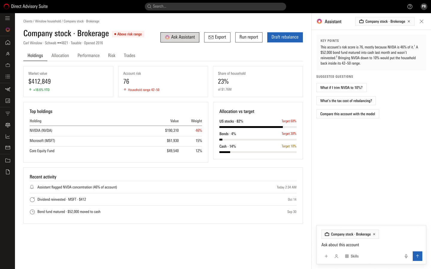
Every workspace page has one Ask Assistant button, and the panel opens already scoped to what is on screen: all clients on the list, one household on the client page, one account on a portfolio. The scope is a chip she can see and remove. Attention items live here too, on the pages they belong to.
The answer has a shape
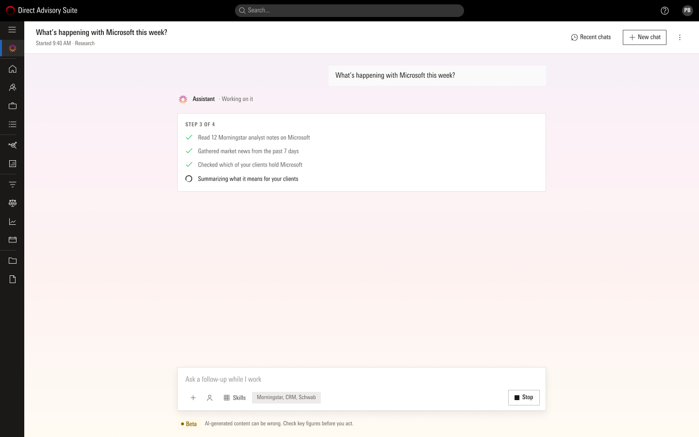
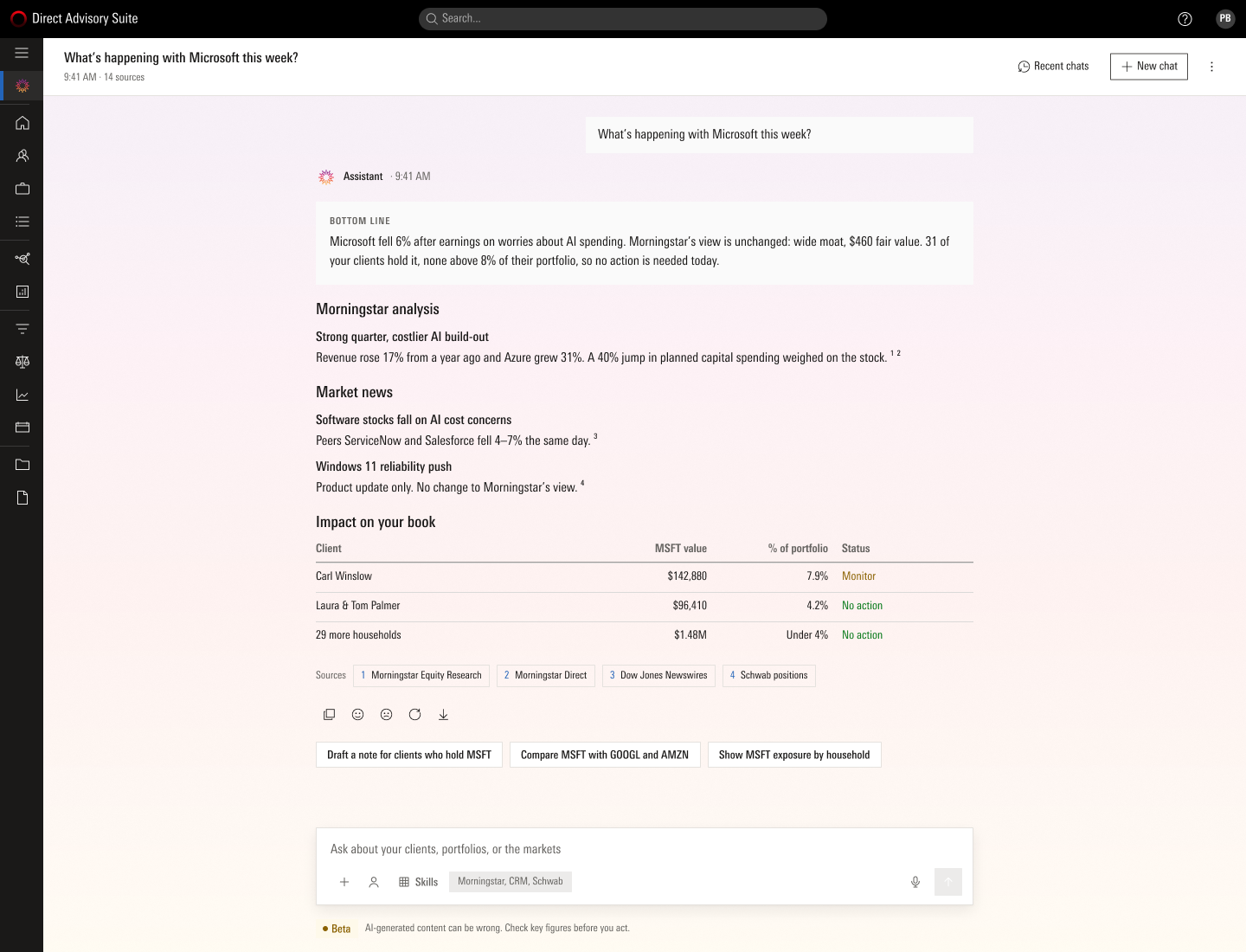
A visible plan while it works, then a bottom line, short sections with a numbered source on every figure, a table of who in her book is affected, and three follow-ups written as the next thing an adviser would do. The same shape whatever the words, because that is what makes an answer checkable.
Ambiguity gets a question, not a guess
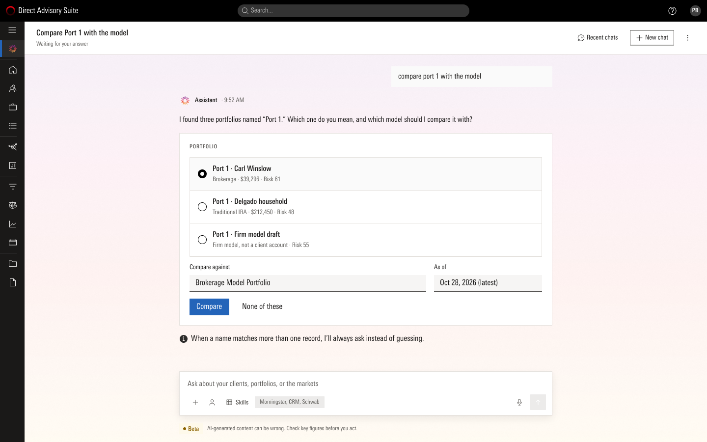
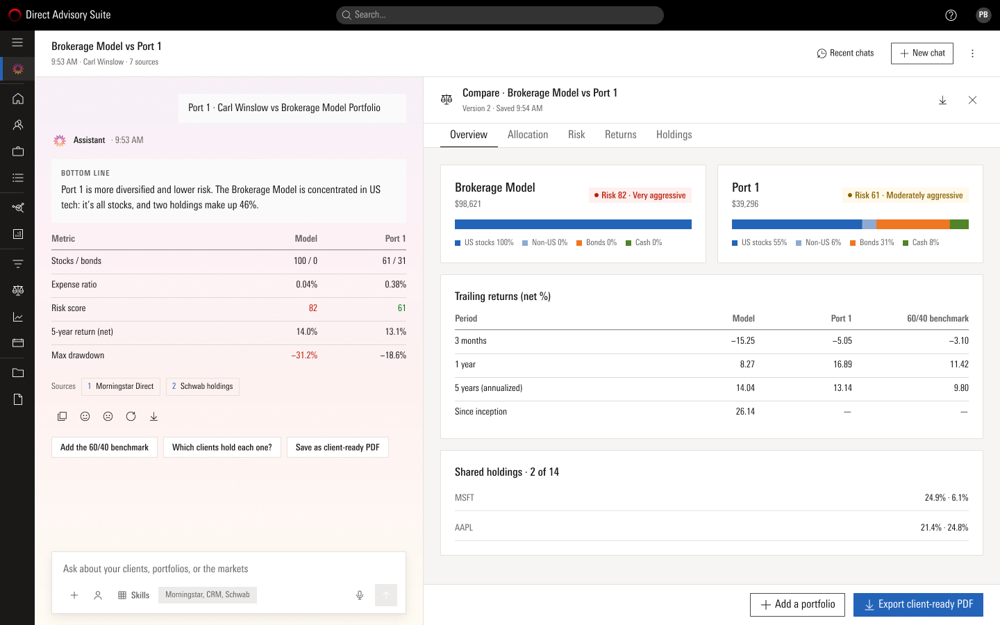
"Compare port 1 with the model" matches three portfolios. The assistant asks with a choice card, then keeps the answer short in the chat and opens the full comparison in a canvas beside it, ready to export.
An alert becomes an action, evidence first
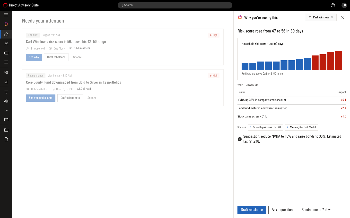
"See why" on a drift alert opens the evidence before any action: the score over 90 days, the drivers and what each added, the sources, and a suggestion with its tax cost.
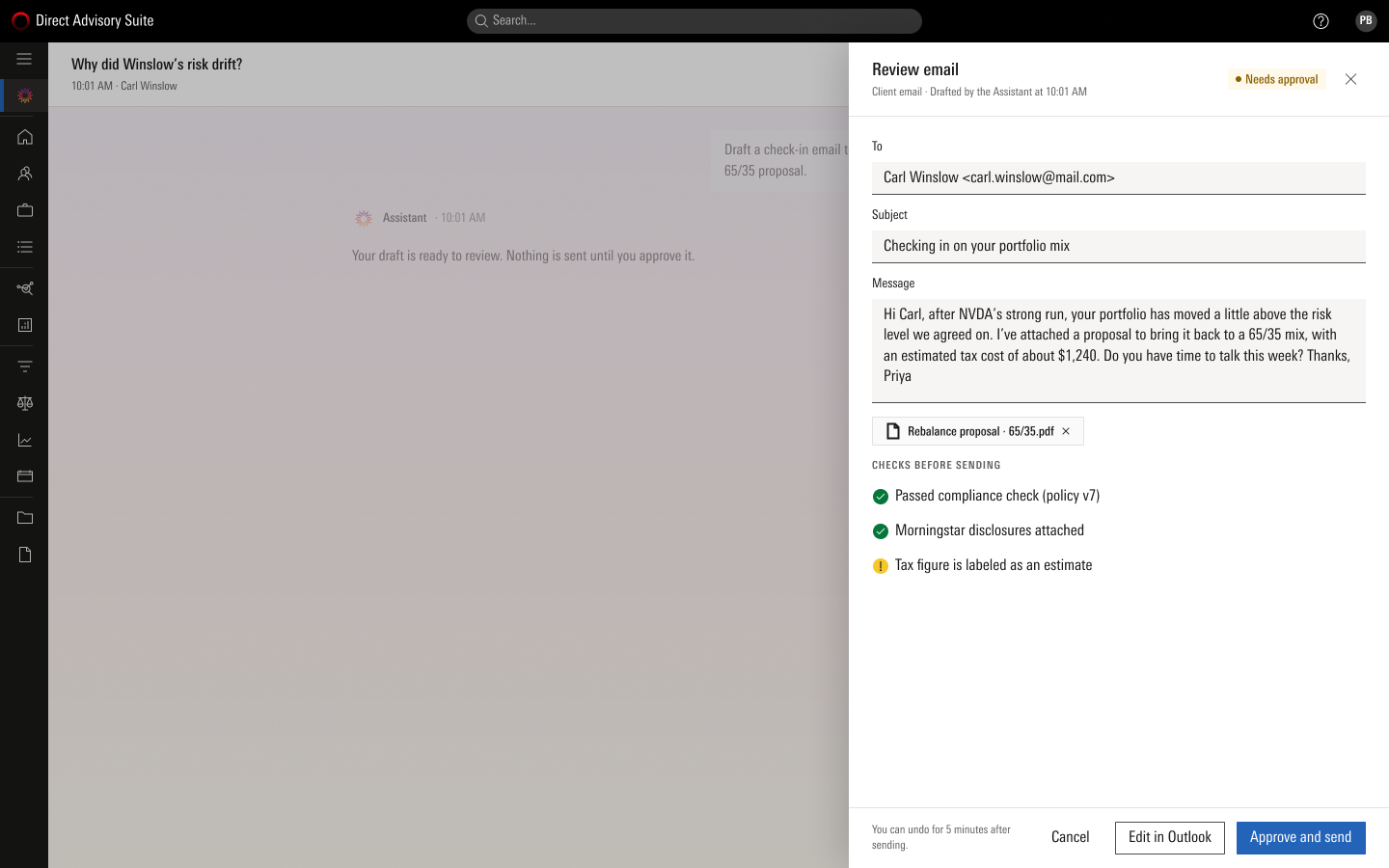
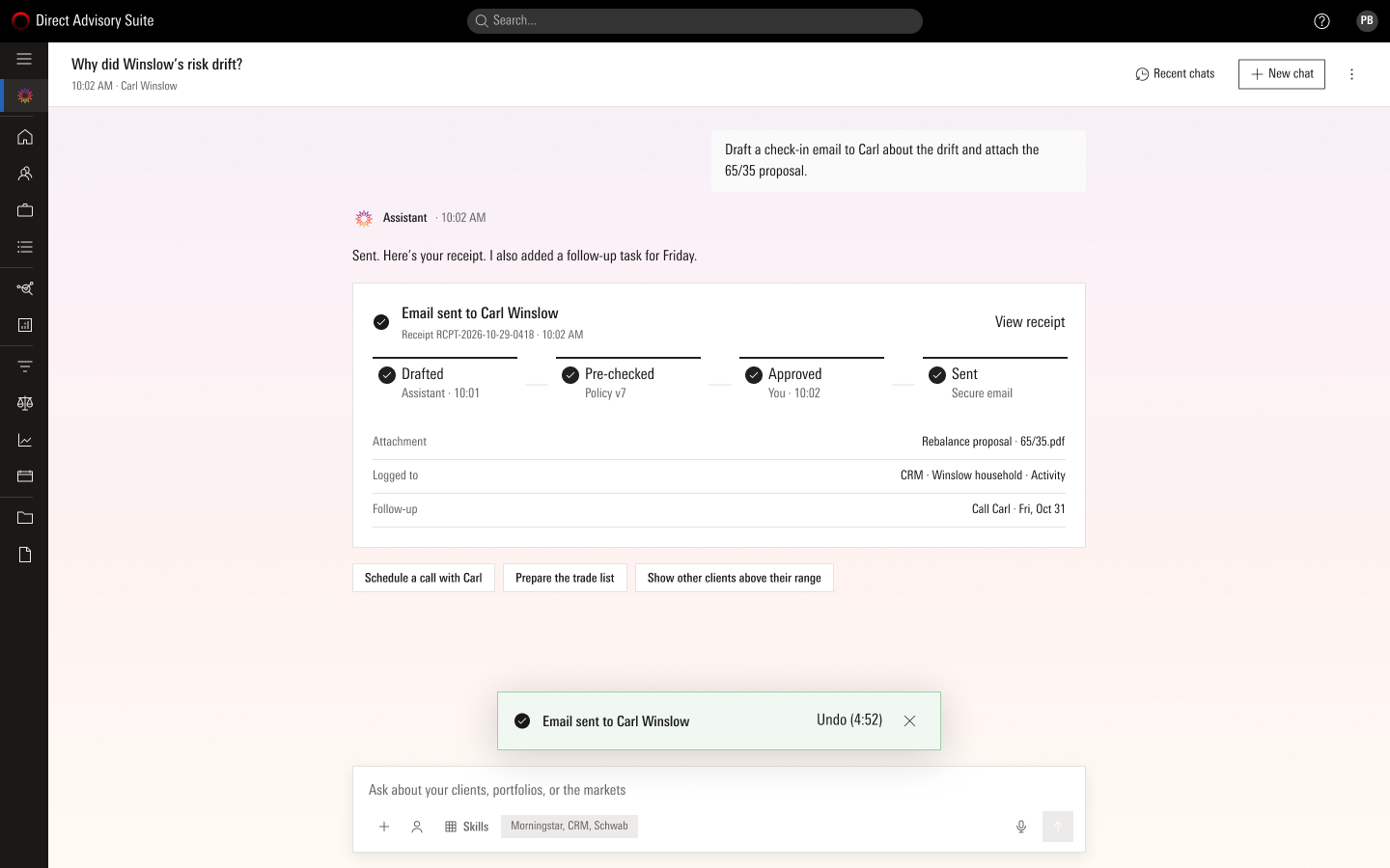
When she asks for a check-in email, the assistant drafts it and says "Nothing is sent until you approve it." The review shows the message, the attachment and the checks it ran. After approval, a receipt: drafted, pre-checked, approved, sent, logged, and an undo window of five minutes.
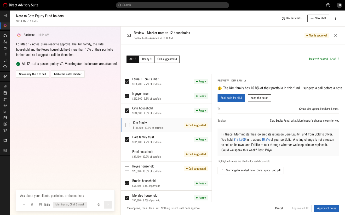
Twelve households, not one
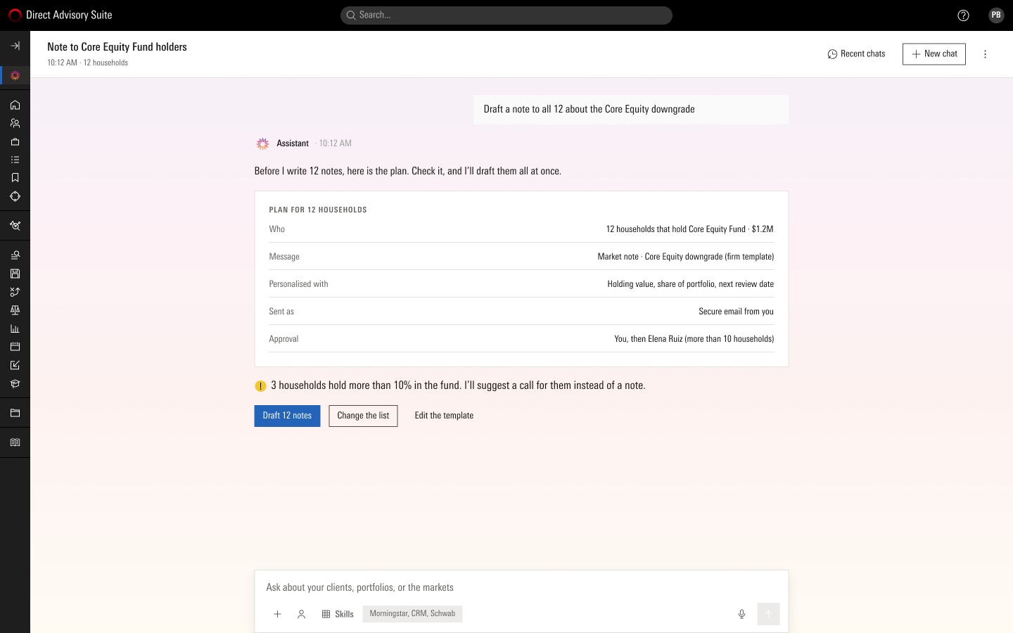
The same journey for the twelve households that hold a downgraded fund. The assistant shows a plan before it writes anything, flags the three who hold more than 10% for a call instead, then lists every draft to approve one by one or all at once. Above ten households a second approver is built in.
08 · The rest of the week, and when it goes wrong
Other journeys, and thirty states beyond the happy path
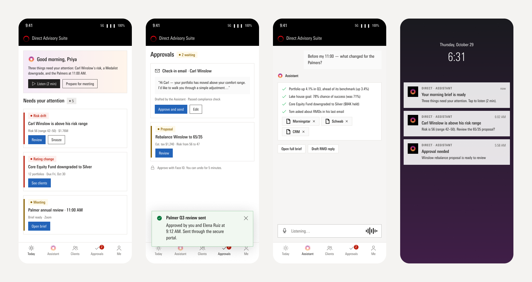
The rest of the week follows the same loop: a daily brief that says what the news means for her clients, onboarding that shows her own book ranked within three minutes, a thumbs-down that drafts a support ticket in the chat, a library and a compliance console that keep every receipt, and a phone for the brief, approvals and a voice question before a meeting.
Trust is won or lost in the failure states, so I designed thirty of them before the happy path shipped: vague requests, missing or conflicting data, slow or broken systems, blocked or partly failed actions, the panel without a scope, and the empty page. Every one says what happened in plain words, keeps the adviser's work, and offers one next step.

Sources disagreeShow both, say which is the record, let the adviser choose
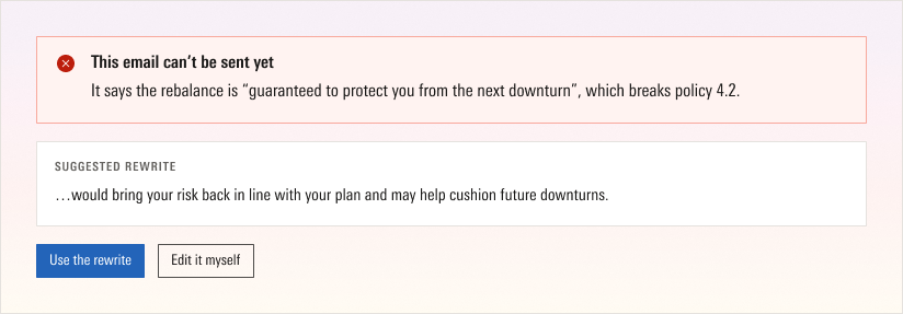
Blocked by a checkQuote the problem, name the policy, offer a rewrite
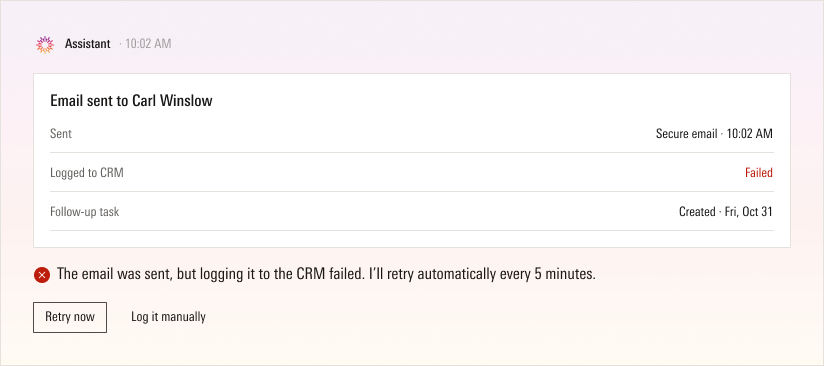
Part of an action failedSay which step, what already happened, retry the rest
09 · Making it real
One design system, one file, one voice
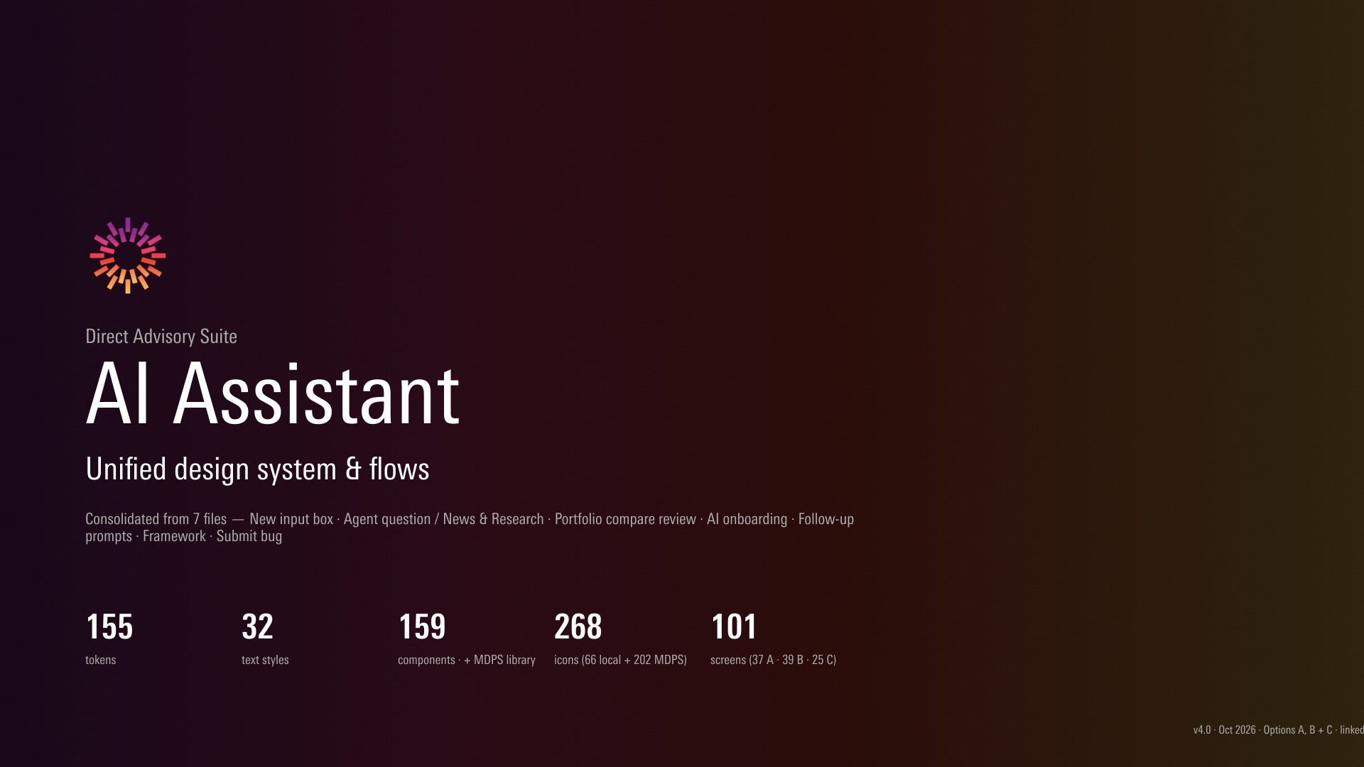
Every screen is built from the Morningstar Design System and its Foundation library, with the suite's own header and navigation, one condensed typeface, 1 px corners, neutral icons, and the AI mark only where it identifies the assistant. The three options live in one file: 101 screens, 159 components, 155 tokens.
A QA pass found grey text at 2.73:1 contrast, allocations that totalled 105%, a risk arrow pointing the wrong way and a hand-drawn copy of the AI mark, and each was fixed in the component. Every string follows one content style guide: the point first, one term per idea, buttons that say what happens, and an assistant that speaks as I and admits its mistakes.
10 · Where it stands, and what I learned
Results, targets, and the honest gaps
I left Morningstar in July 2026 while the assistant was in beta, so the numbers are from the beta period and the team's own reporting.
34%
adoption among eligible advisers during beta
45%
fewer workflow steps from question to report
3
journeys shipped end to end in the beta
The unified design is measured against targets I set for the pilot, not results: the north star is weekly active advisers who approve at least one assistant draft, with a sourced answer in under 60 seconds, a 12-household outreach in under ten minutes, every figure sourced, and zero unsupervised client-facing actions.
If I did it again
The most valuable thing an assistant can do is not answer questions; it is decide which questions are worth asking today. Start with what the product already knows.
Trust is a set of components, not a tone of voice. The plan, the sources, the clarifying card, the review, the receipt and the undo each answer a specific objection, and built as parts, every new journey arrives with trust already in it.
The home is not the product. A page that ranks everything looks powerful and competes with the suite it lives in. Quiet by default was the hardest principle to keep.
The model's answers, and the words around them, are part of the design. Writing the answer as a template and reviewing live output against it is the work I would start first next time.