Background
Before a financial adviser can give advice, they need to know the client. Who they are, who depends on them, what they earn, own and owe, and what they want to do. In Australia this is called a fact find.
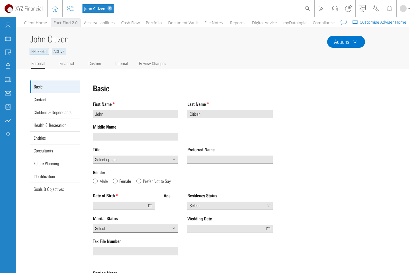
In AdviserLogic the fact find was a set of forms the adviser filled in. It has nine areas, from basic details to estate planning. That works for an adviser who uses it every day. It does not work for a client who sees it once.
My role
I designed both sides of the product: the questionnaire the client fills in, on web and mobile, and what the adviser sees before and after. I also built the component library and the layout guide for the developers.
The goal
Our goal was a fact find a client could finish in about ten minutes, on their own, before the first meeting. So the adviser can spend the meeting on advice, not on data entry.
3
sections: personal, financial, goals
10
minutes, the time we tell the client it takes
120+
screens across web and mobile
I worked to four rules.
Rule 1
One question at a time
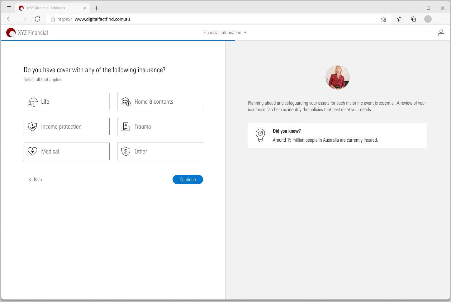
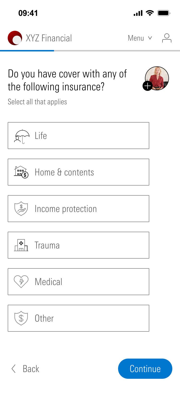
Each page asks one thing. A yes or no answer decides whether the next pages appear at all.
Rule 2
The adviser is there
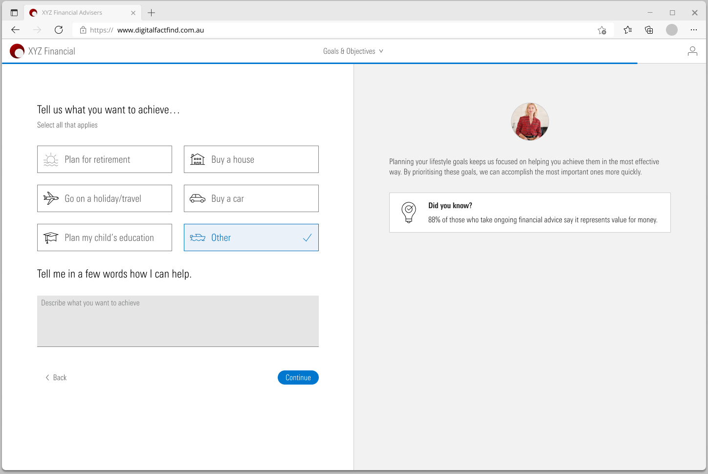
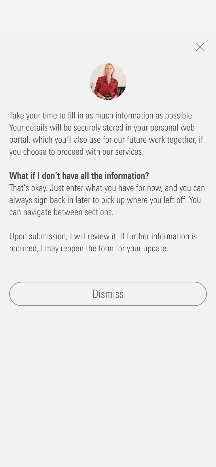
Every page has the adviser's photo and a short note in their voice. It should feel like a conversation, not a form.
Rule 3
An estimate is fine
People do not know their exact expenses. The product says so on almost every page and lets them come back later.
Rule 4
Check before you send
Each section ends with a summary the client can edit. Nothing goes to the adviser until the client submits.
How it starts
The adviser opens the client in AdviserLogic and chooses Send Fact Find. They get a link to share, with the date it was made and the date it expires. The client opens the link and confirms who they are with a code sent to their email.
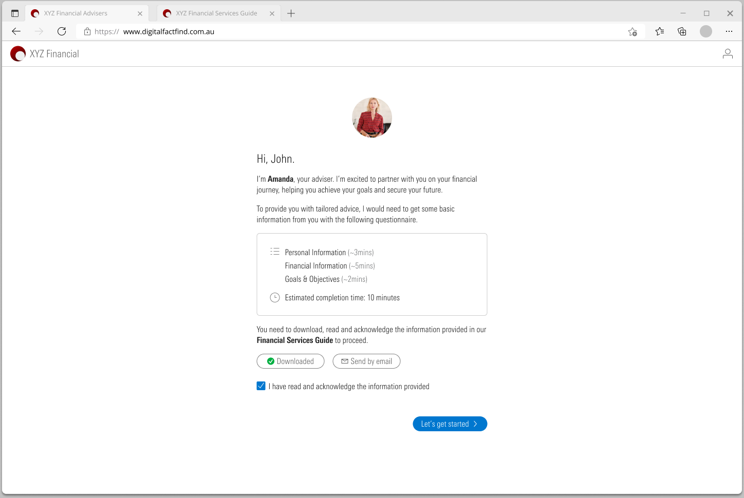
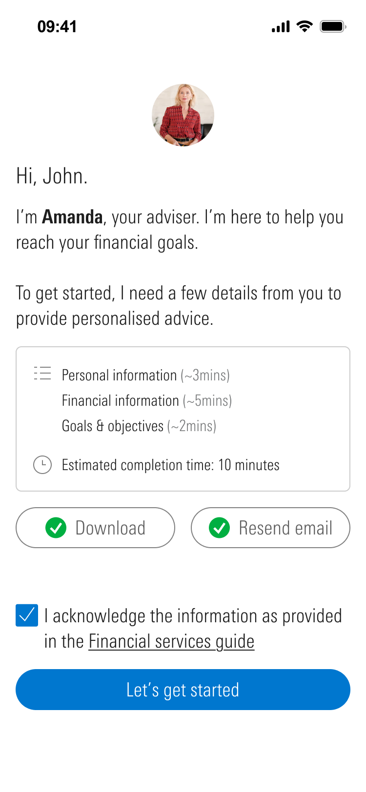
The first page is a welcome from the adviser. It lists the three sections with a time for each, about three, five and two minutes. The client has to be given the Financial Services Guide before going any further, so the start button stays off until they have downloaded or emailed it and ticked that they have read it.
One question at a time
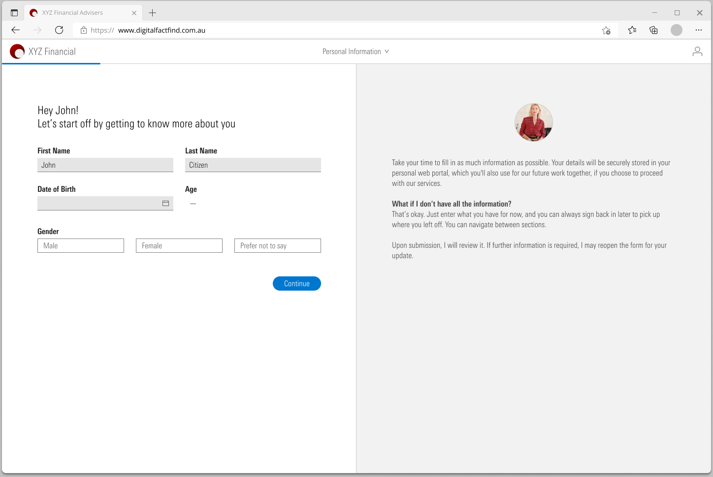
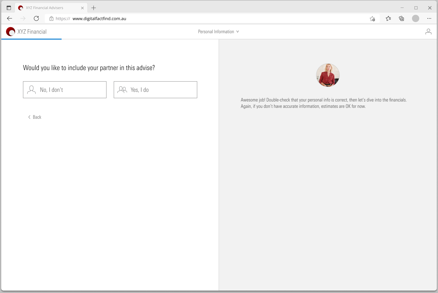
The personal section could have been one long form. I broke it into small pages and put a yes or no question in front of each group. Do you want to include your partner? Do you support anyone? Do you have a company or trust? If the answer is no, the client never sees those pages.
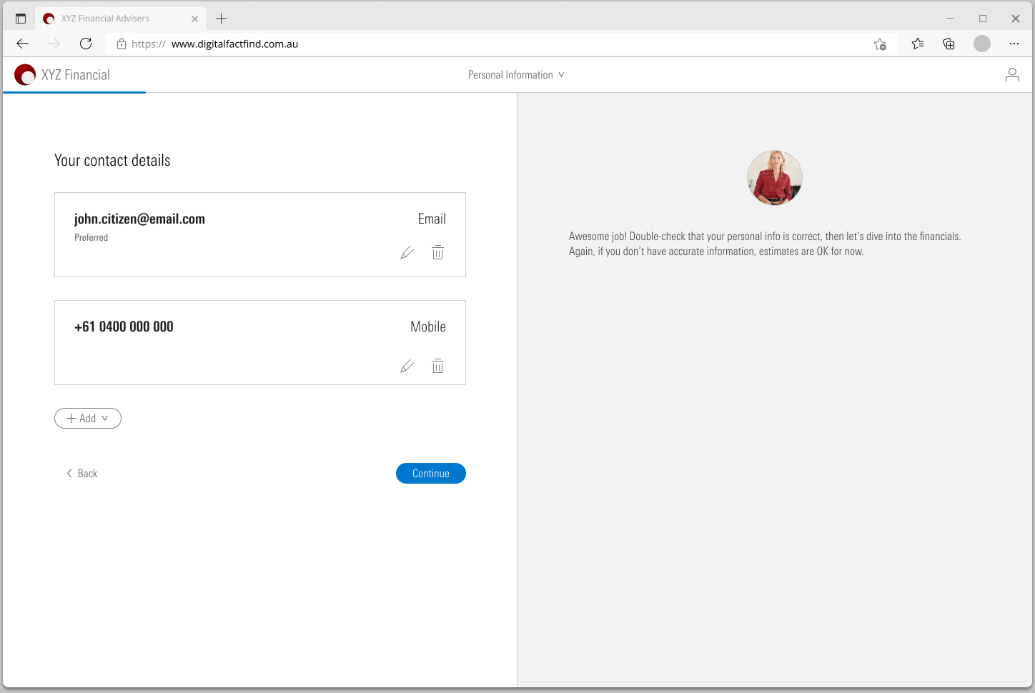
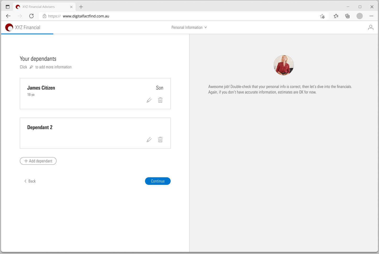
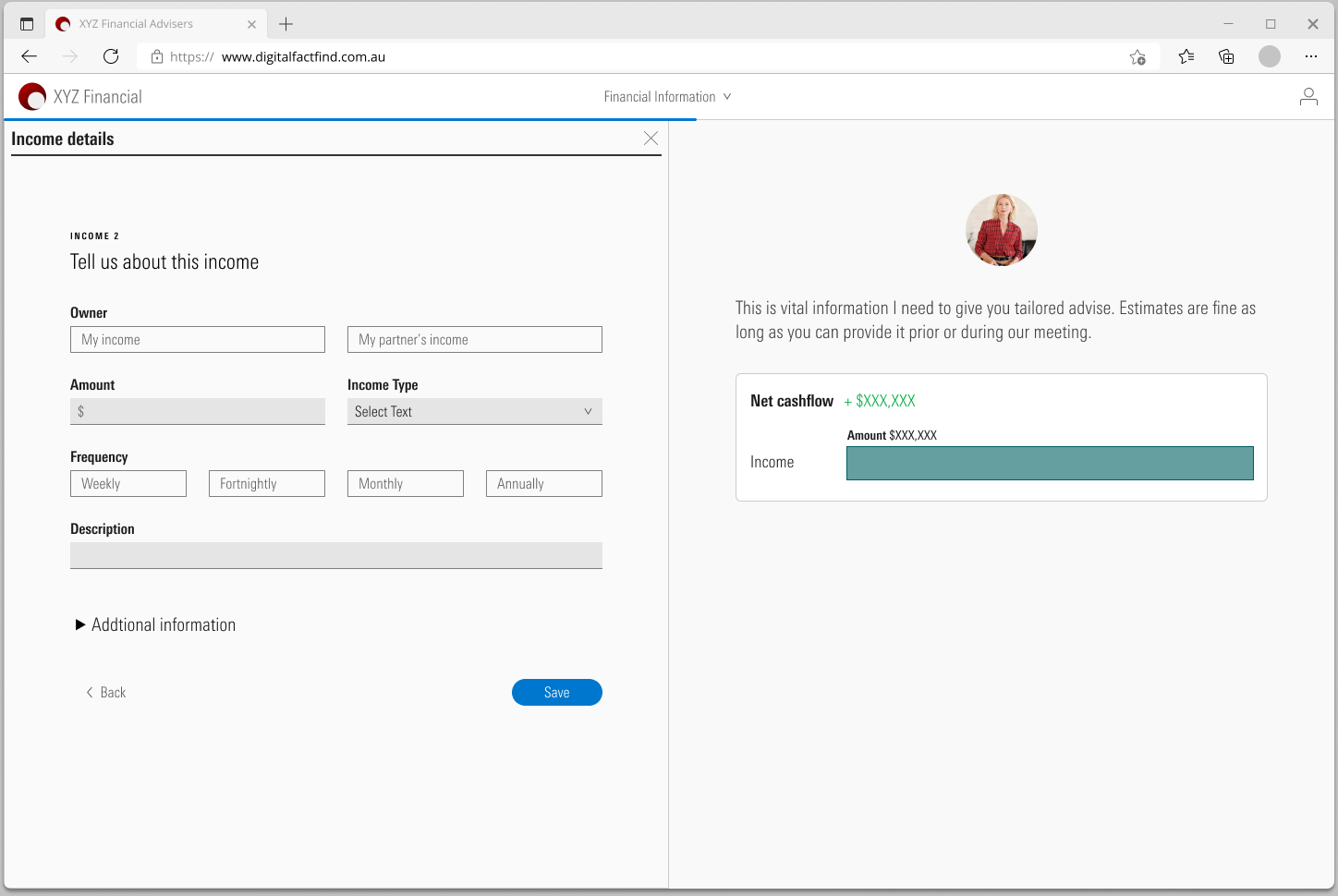
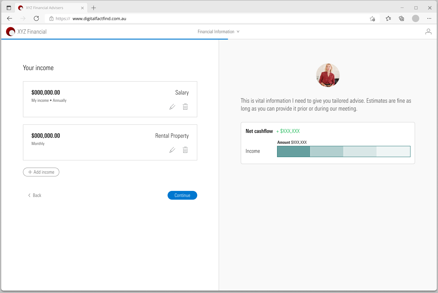
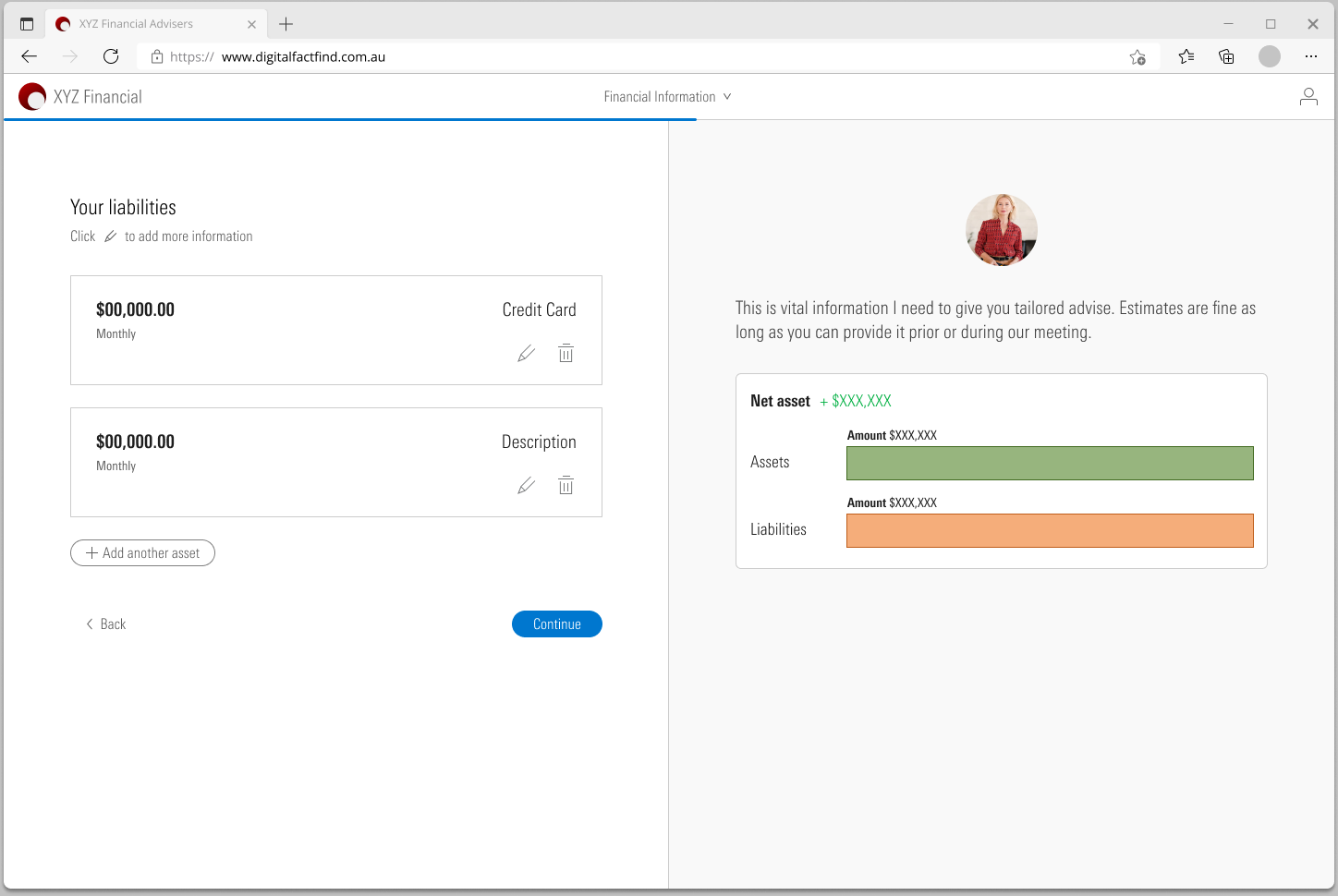
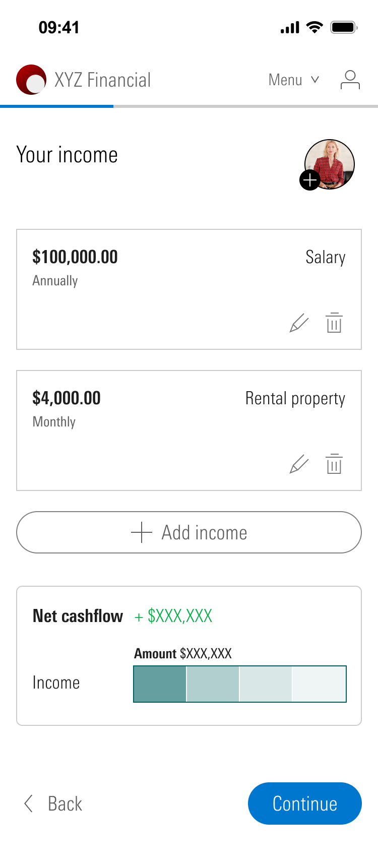
Anything a client can have more than one of works the same way: contacts, addresses, dependants, income, assets. Fill in a short form, save it, and it becomes a card in a list with edit and delete. Learn it once and it works everywhere.
The adviser stays on the page
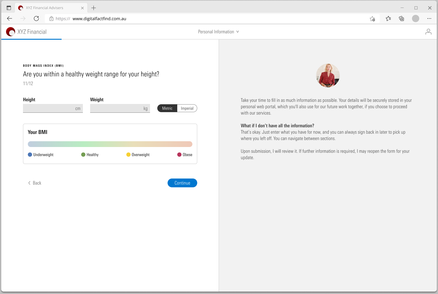
On desktop the page is split in two. The questions are on the left. On the right is the adviser: their photo, a line about why they are asking, and sometimes a short fact. When the question is about insurance, the note is about insurance.
This panel does a second job. It answers the question people ask most in a form like this: what if I do not know? The note tells them to enter what they have and that they can sign back in later.
Money you can see
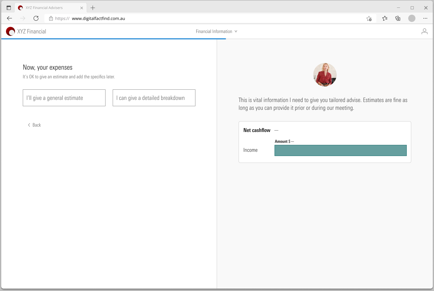
The financial section is where people give up. So the adviser panel turns into a chart. Each income the client adds grows a net cashflow bar. Expenses sit under it. Assets and liabilities build a net asset bar in the same way. The client sees a picture of their own money take shape as they type.
Expenses got a different treatment. Most people cannot list them. The first question is a choice: give one general estimate, or give a detailed breakdown. Both are accepted.
Check before you send
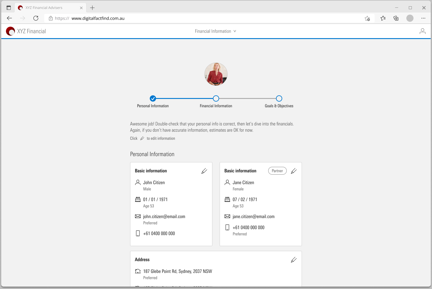
Each section ends on a page that shows what the client has entered, as cards with an edit button. A stepper at the top shows where they are: personal, financial, goals.
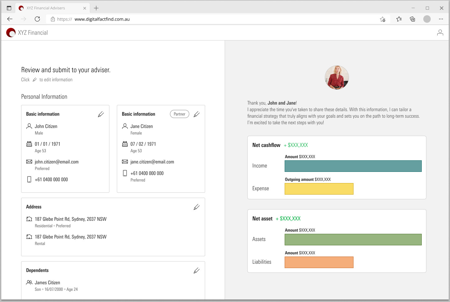
The last page puts everything together, with both charts beside it. Submitting asks the client to confirm the information is true and correct. Then a message tells them their adviser will be in touch.
On a phone
Many clients will open the link on their phone, so I designed the whole flow again at phone size. It is the same questions and the same words. Two things change.
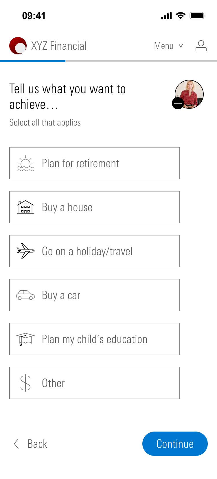
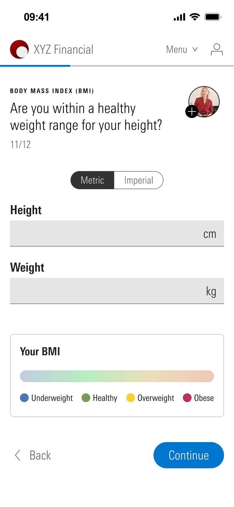
There is no room for the adviser panel. It becomes the adviser's photo in the corner of every page. Tap it and the note opens. And the section switcher becomes a menu that shows which sections are done, with help, contact adviser and sign out.


What the adviser gets back
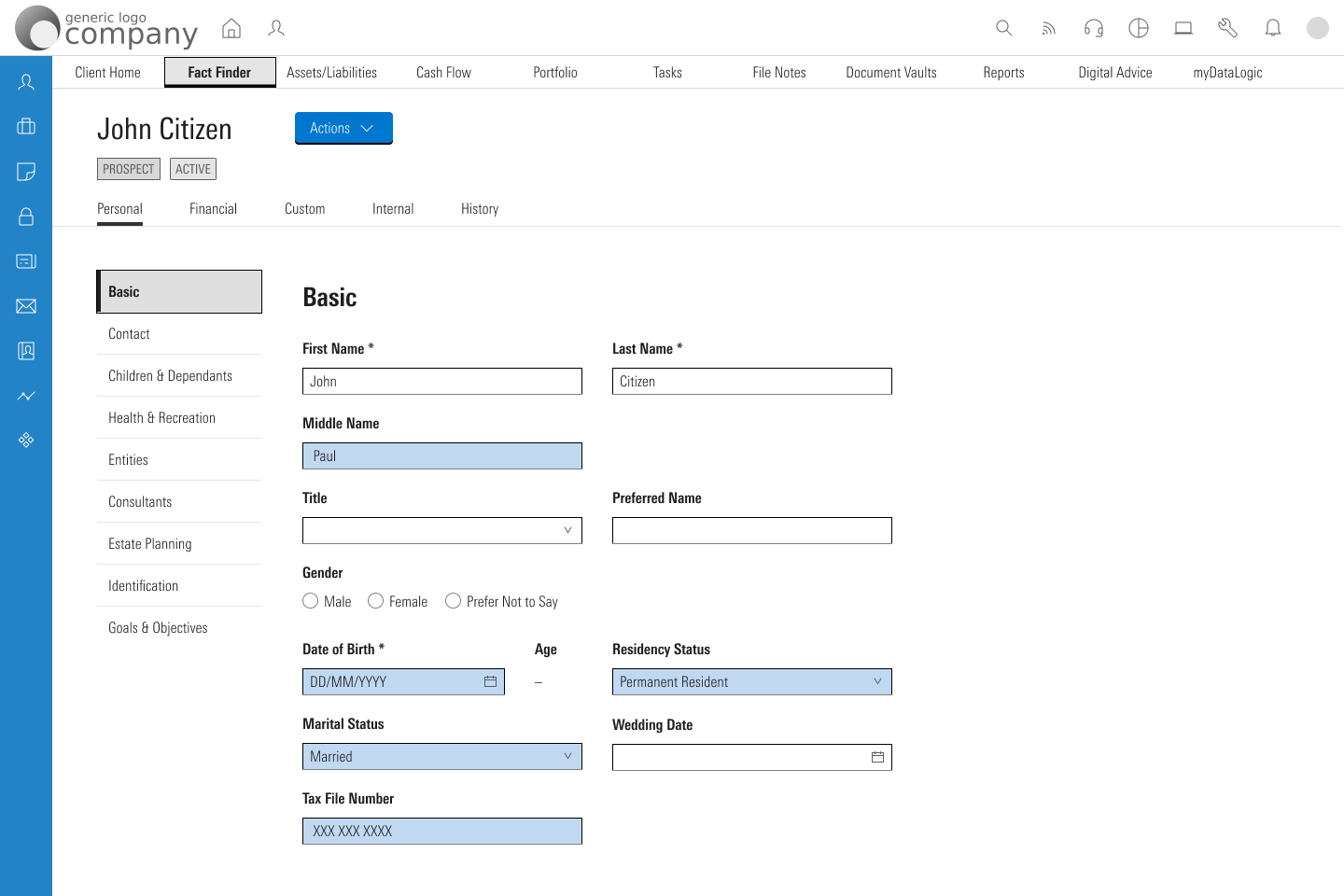
When the client submits, the adviser gets a notification on their home page. Opening it takes them to the client's Fact Find, with the fields the client filled in highlighted in blue.
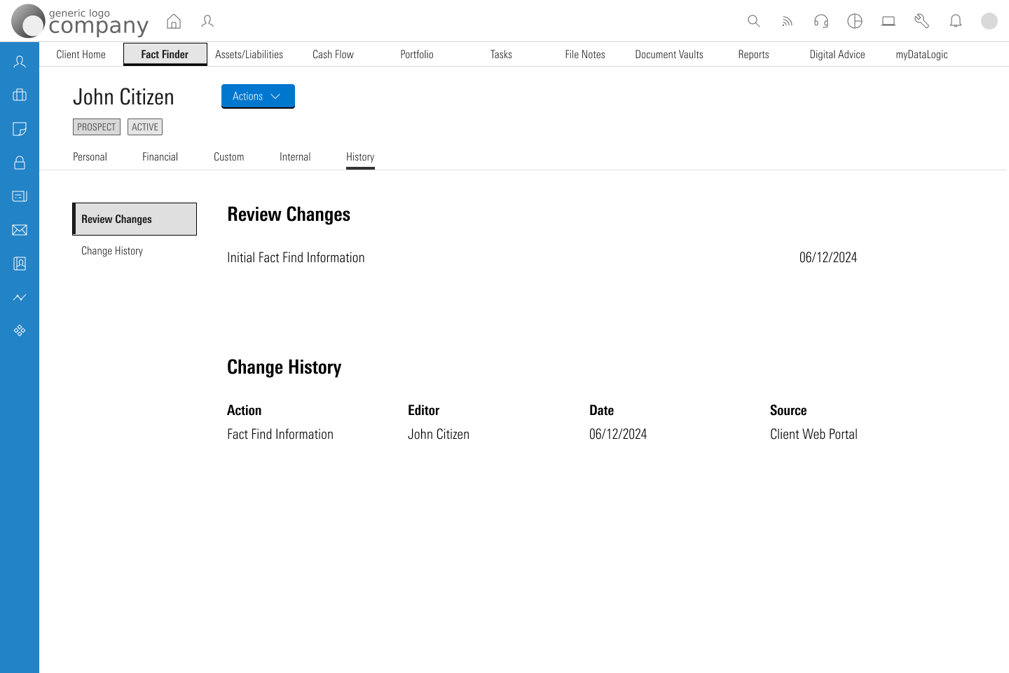
A History tab keeps the record: what came in, who entered it, when, and that it came from the client. The adviser can always tell which details the client gave and which they typed themselves.
Handing it to developers
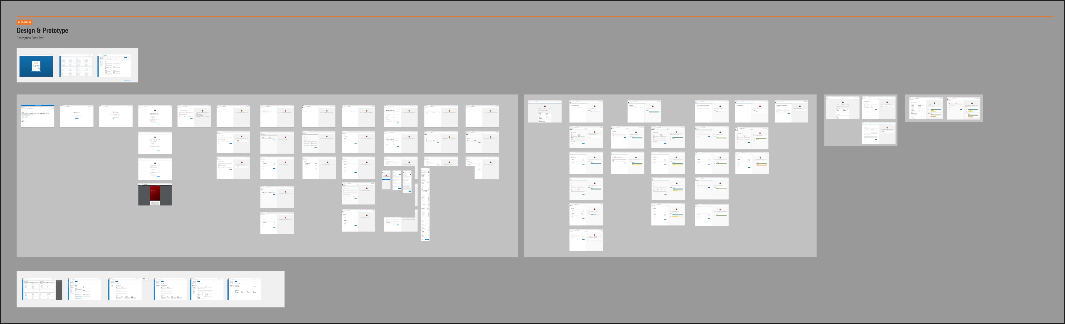
Everything is built from one set of components: the header, the adviser panel, forms, cards, charts and the summary page. In the file I marked each group as build, or as design only for the pieces that exist just to make the prototype work.
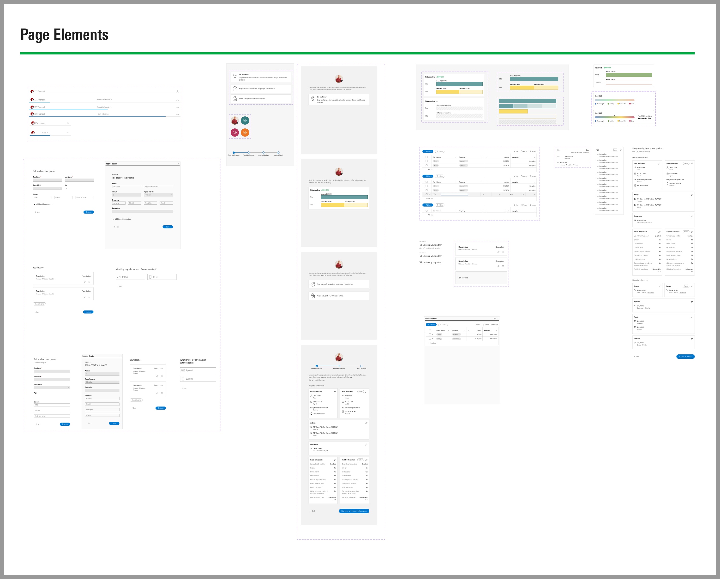
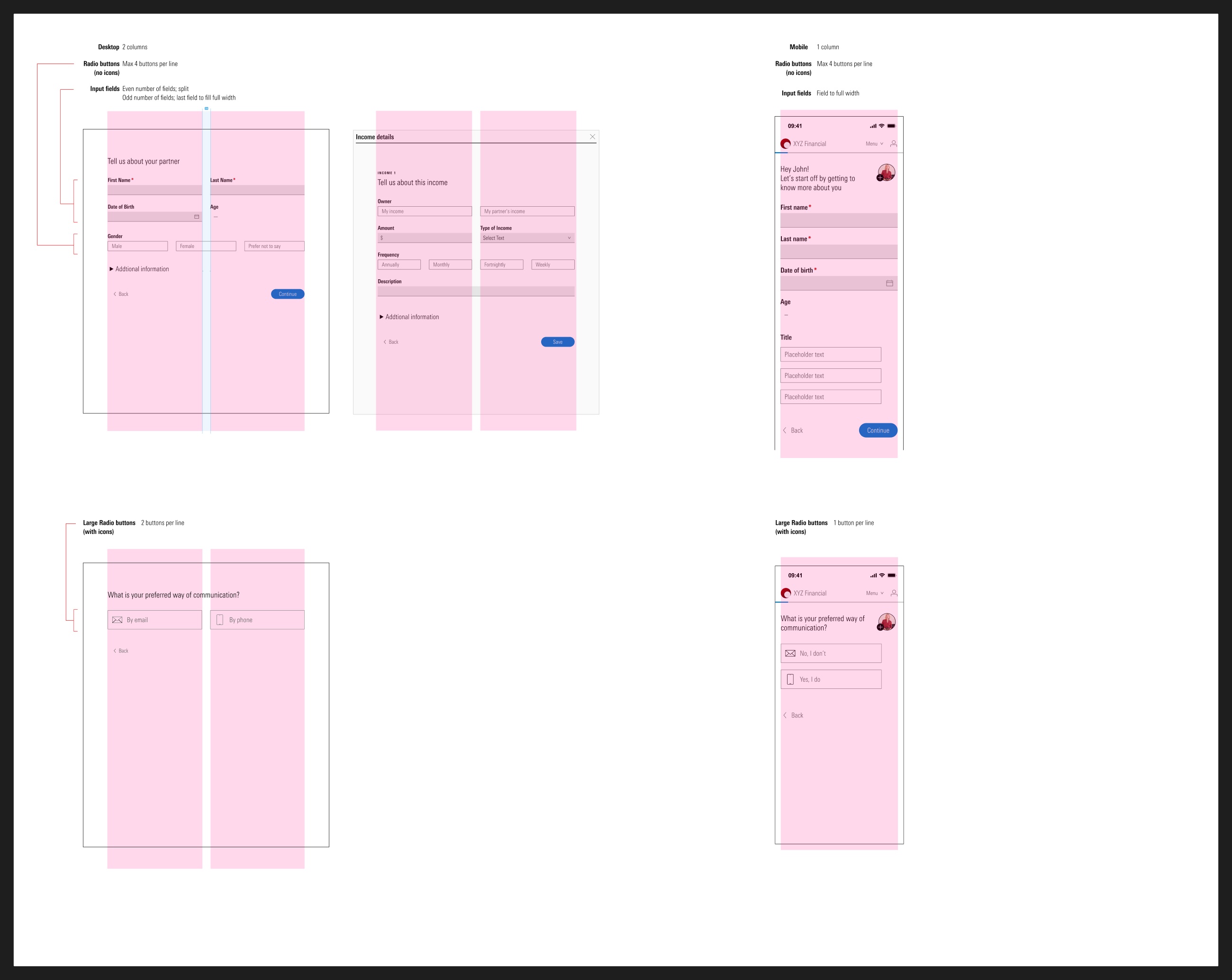
I also wrote the layout rules down so nobody had to guess. Two columns on desktop, one on mobile. An even number of fields splits in two, and with an odd number the last field fills the row. Up to four radio buttons on a line. Large buttons with icons go two to a line on desktop and one on mobile.
The prototype is wired from the adviser's sign in to the client's last page, so the team and stakeholders could click through the whole thing.